This is my personal blog. The views expressed on these pages are mine alone and not those of my employer. This is not AI. All hallucinations are my own human ones.
Microwave
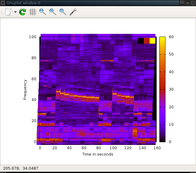
Two interesting things I saw when listening to the output from my microwave:
- The frequency is not stable. I assume it’s not thermally controlled.
- Probably not a good idea to use WiFi channel 6, being 2.437GHz+-11MHz and all.
Near the microwave
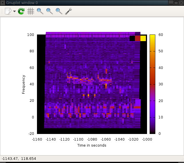
Some rooms away from the microwave
Separate measurement some rooms away.
How to generate the graphs
# Edit usrp_spectrum_sense.py so that it prints time.time() instead of datetime.now()
./usrp_spectrum_sense.py --dwell-delay=0.1 -A RX2 -s 8000000 --real-time 2.4e9 2.5e9 > near-microwave.txt
# Edit near-microwave to remove the stupid verbose messages from the top.
cat > microwave.plot << EOF
set view map
set size ratio .9

set object 1 rect from graph 0, graph 0 to graph 1, graph 1 back
set object 1 rect fc rgb "black" fillstyle solid 1.0

set xlabel 'Time in seconds'
set ylabel 'Frequency'
set zlabel 'dB'
set terminal epslatex color
set output "near-microwave.eps"
splot 'near-microwave.txt' using ($1-1496693552.11):((($5/1000-2400000)/1000)):4 with points pointtype 5 pointsize 3 palette linewidth 30 title 'Signal'
EOF
gnuplot microwave.plot
convert near-microwave.{eps,png}
I can’t have GNUPlot output PNG directly because it hangs.
The magic value 1496693552.11 is the first timestamp in the file.
disqus has started showing ads. :-(
Showing (probably incomplete) comments in a static read-only view. Click button to be able to leave comments.